Bad UI for quick settings on Nougat for Samsung Galaxy S7

frog238
Enthusiast - Level 1

What ever happened to applying the principle of contrast in user interface (UI) design?  The Nougat update for the S7 results in thin, blue wire-frame icons against a white background for the quick settings screen.  In low light conditions, especially with the new blue light filter activated, it is hard to see the flashlight icon when one needs it, like at night when one is trying to use the LED flashlight (third icon from the left on the screen shot below): try this on in the dark on your S7, it may not be so evident from the screen shot below, if you are reading this from a computer screen. 

2017-03-07 12.12.46.png

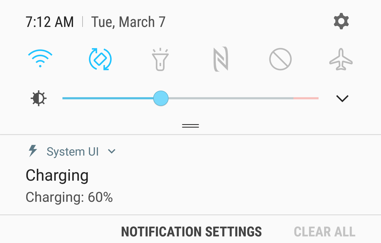
The issue is not quite as bad in the full settings screen when you have orange wire-frame icons against white (below).  The grey wire-frame icons against a white-background in quick-settings is just really bad design.

2017-03-07 12.34.12.png

Labels (2)
4 Replies
KellyArens
Contributor - Level 3

When you apply themes to the phone the colors change.

mama23dogs
Legend

I'm not fond of it either.   Complain to Samsung, they are responsible for update software, not the Carrier.

kincaed
Contributor - Level 2

As already noted I highly recommend looking at other themes. The Samsung theme store has lots of options. I've been using a theme since back when I got the S7 running Marshmallow. While I do greatly like the UI improvements of Nougat (Android 7) over Marshmallow, there is definitely an issue of lack of adequate contrast in the default UI.

0 Likes
Reply
syneright
Newbie

The theme I have tried do not effect the UI. This white background is terrible. Hard to make out the icons

0 Likes
Reply